The Readiness Scorecard
Here’s how product teams measure the readiness score of the users in adopting to a new product / feature towards helping all internal teams align...

Ever wondered how your users feel when they have to drop something that they have been following / doing rather religiously for years & onboard / use a relatively new feature / tool / product often driven by a decision that’s linked to productivity through their own management?
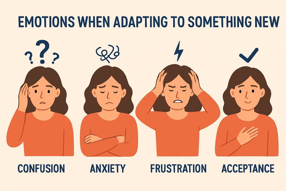
If you are familiar with business analysis or have ever been playing one such IT Business Analyst’s role at a large IT / ITES org. you’d surely know the importance of diving into the “RESISTANCE TO CHANGE” documenting it as an integral part of that Change Management process. Fair enough, business analysts are people who are known / hired to drive change towards making things better & are expected to do so rather continuously. And that doesn’t sit well with the users owing to how even a small change could be perceived as a painful process leading to unending cycles learning / unlearning / relearning eventually triggering one of the oldest & primitive reactions linked to the tendency of us humans which is to stand up against & entirely oppose the change without paying any heed to whether or not the change would really benefit us. So, there’s always been a love-hate relationship between the users & those analysts.
But fast forward to today where AI products are taking the users by a storm given the shorter cadence of releases & the competition going neck-to-neck, the cruciality of measuring whether or not users are ready cannot be ignored. Also, given how AI products / features are just thrown out there in the open bearing those fancy colorful labels that go “Hey! Try me for FREE TODAY”, something of an assessment to analyze the readiness of the users to adapt does make a lot of sense, serving product teams with the much-needed clarity not just from the standpoint of blockers but also the effort those CS teams would have to put in towards improving sign-ups / conversions.
Gauging Users with a Readiness Scorecard
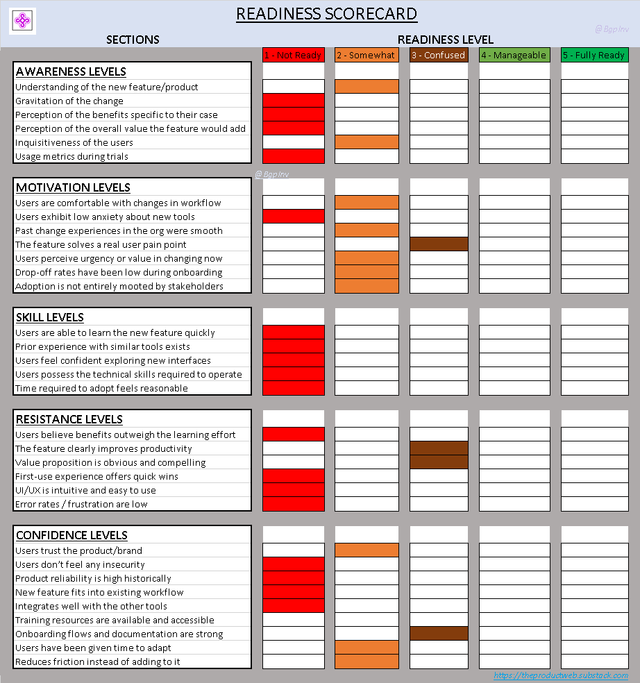
A readiness scorecard is a progress report highlighting the overall acceptance levels of the users in adopting to a new piece of technology, segmenting it over multiple headers right from their mindset, skill levels, intensity of training needed & the ease of use.
NOTE: Color coding is strongly recommended towards representing the sum of the parts, highlighting the criticality of each & every aspect intern contributing to the overall score.
Let’s dive into the sections & each of the parameters that go into the scorecard.
Scorecard - The Elements:
1) Awareness Levels
The collective awareness levels the users have over a given domain or a problem & their percept in which technology is employed to solve those problems does make a huge difference in their adoption patterns.
For instance: It’d be a hard nut to crack if you have to push the advanced AI features of Canva on to someone who has been designing in CorelDraw around 2 decades back as there’s a good chance that they may be unaware of their capabilities (rather rare you’d think given today’s timeline but still very possible).
So, some parameters that you should be measuring here are:
Understanding of the new feature/product
Gravitation of the change
Perception of the benefits specific to their case
Perception of the overall value the feature would add
Inquisitiveness of the users
Usage metrics during trials
2) Motivation Levels
The actual reason, the main central motivation that drives the users towards thinking beyond what they currently use could play a vital role in influencing the end decision to adopt to anything new, more so if that motivation is innate & doesn’t stem from external factors / decisions.
For instance: It could be a cakewalk to introduce & onboard users on to a tool like SketchWow from those traditional PPTs & slides given how the former does a neat job of visually uplifting the content.
Gauging a few of these can certainly help establish the motivation:
Users are comfortable with changes in workflow
Users exhibit low anxiety about new tools
Past change experiences in the org were smooth
The feature solves a real user pain point
Users perceive urgency or value in changing now
Drop-off rates have been low during onboarding
Adoption is not entirely mooted by stakeholders
3) Complexity & Skill Levels
When some products / features could bear some degree of complexity given the nature of their workflow, there is no denying the fact that using some of them do demand users to gain a certain skill level before they hit a comfort zone in spite of being thoroughly aware of the value it can add.
For ex: Using a few of those products bearing robotic interfaces does demand substantial training before the users feel comfortable & use it regularly. And using it may not be as simple as what’s depicted over those video walkthroughs.
You ought to be able to tick these off at first:
Users are able to learn the new feature quickly
Prior experience with similar tools exists
Users feel confident exploring new interfaces
Users possess the technical skills required to operate
Time required to adopt feels reasonable
4) Resistance Levels
The resistance of the users to adopt a newer way of work or a new solution could bring out all their insecurities given how it could involve a significant learning curve & a cycle time. But even otherwise the resistance from the users could be pretty stiff sometimes making it a hard nut to crack.
For ex: Users who are using the simple calculator application on their machines could resist the move strongly if the solution team tries to remove the access to the application in spite of automating it towards making it easier.
Making these checks are thoroughly recommended:
Users believe benefits outweigh the learning effort
The feature clearly improves productivity
Value proposition is obvious and compelling
First-use experience offers quick wins
UI/UX is intuitive and easy to use
Error rates / frustration are low
5) Confidence Levels
Building solutions, launching features / products seamlessly could be a cakewalk for most teams & although they tend to do it like clockwork, the confidence the users have in the solution being shipped does make a world of a difference as that could eventually be the reason it sticks or falls apart.
For ex: With AI tools rampant as of today although an org. would want to make headwinds in incorporating the new tech, the users could be gripped with fear given how they may feel like they are stepping into totally alien territory.
You could run these checks to gauge the confidence of the users:
Users trust the product/brand
Users don’t feel any insecurity
Product reliability is high historically
New feature fits into existing workflow
Integrates well with the other tools
Training resources are available and accessible
Onboarding flows and documentation are strong
Users have been given time to adapt
Reduces friction instead of adding to it
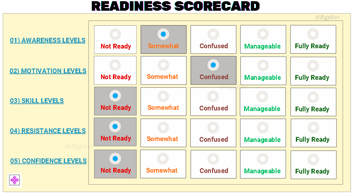
Score Card - Sense-making:
Each of those pointers mentioned across those five sections could be rated either via color coding or using a number scale like: [1 = Not Ready, 5 = Fully Ready] like shown below in the Article Assets section.
Making sense of the scorecard - although different orgs. could employ a varied level of stringency, it is highly recommended that you ensure a score above 80% if you are looking at a number scale, aggregating it like so:
4.0–5.0: 🚀 Fully Ready
3.0–3.9: 👍 Ready With Support
2.0–29: ⚠️ Needs Preparation
< 2.0: ❌ Not Ready — Requires More Work…
And if you are looking at color-coding then ensure you get a minimum of 4 greens overall - preferably FULLY READY if not MANAGEABLE.
Article Assets:
1) Readiness Scorecard - ABSTRACT:
Now, a high-level view of such a scorecard could look like this:
2) Readiness Scorecard - DETAILED:
And a detailed / thoroughly segmented view of the scorecard ought to look something like this covering each & every of of those points exhaustively bearing a marking against each of them: