Catch-22
Tons of ideas may get generated right from individual desks of Engineering & Product teams to the CXOs, EXECs. Measuring the strength of each of those ideas ought to be more of an imperative step.
How much is “good enough”?
I could take an idea to my supposed target market and discuss it with a few of my potential future users. And supposing, the response may vary from “Wow” to “Yes, this is good” would that be enough to label it “motion carried” and go ahead with the build steps of the product or would there be a necessity to subject it further to more cycles of user interfacing and feedback?
Really! How much of that validation may be required to term the idea / hypothesis good to be carried ahead with absolutely a high level of confidence?
That situation right there has had a reputation of being a catch-22 for quite some time now.
And, come to think of product management and product rituals followed across teams regularly, this uncertainty is more or less the order of the day. That’s perhaps where the whole idea of bringing in all those years of experience under the sun to weigh in over discerning the future moves come into play for a product person.
But having said that, some of these sentiments are measurable and testable across various methods and many tools available in the market today specific to the area that one would want to carry out the test for. The first thing that perhaps comes to mind in this scenario, is more conventional, has been around for quite some time too would be “Surveys”. If built and run effectively surveys can do a world of good in getting quick insightful responses over being able to account for both Quantitative and Qualitative data.
Truth be told - Surveys can induce a lot of bias sometimes. That’s perhaps why it is recommended that one runs it for some time post the first float.
But, supposing you want to measure the demand over a certain feature that you have in mind which can deeply benefit the community of existing users but at the same time you would want to measure and gauge it’s interest over a few specifics like the no. of people who visit the site (or) no. of people belonging to a particular customer segment. What then?
A survey wouldn’t serve the purpose here as it is more of a thing to be measured in-App / over a LIVE session when the user is actually using it. It is for that very purpose a 404 / Trap Door / Fake Door / Painted Door Test is employed usually.
Trap Door / Fake Doors Tests
Fake Doors are a great way to get an understanding of the user’s reaction to a certain feature / idea built over a hypothesis that’s yet to be validated while the product is up live and running. These tests take many names and they could be called anything from Smoke Tests, Trap Doors, Fake Doors, 404s, Painted Doors.
When the nomenclature may differ, the underlying purpose remains the same, which is to gauge user interest grossly over:
A New product
A New feature much before it could get released and be made accessible to the broader markets on a large scale via a visible launch.
When there literally aren't any boundaries on when these tests could be carried out, it makes sense to carry them out during Ideation stage. They may be used to measure a host of things from:
Customer's interest over the said feature
Customer Segments & Demographics
Based on the target audience chosen for the Trap Doors test, these could also be classified as:
Internal - Tested over an existing customer base
External - Tested over a wider audience of prospects, non-customers
One parameter of prime importance is CTR (Click Through Rate) is a measured as:
The clickable area could be anything from a button, banner, image or even label / text which in essence should be able to effectively capture the imagination of your target audience with relevant information presented over a nicely written copy perhaps, enticing them to interact with that area / snippet of the screen.
Traditionally Trap Doors are built just to get the audience to click and then they are known to be treated to a dummy page with message like:
Coming soon!!
Thank you for your interest, this will be ready in 'x' time.
Please leave your contact & we'll apprise you soon as this feature / product launches.
The test usually runs for a certain period and the person / organization running the test aims to collect as many responses as possible from his target audience who should ideally represent a section / percentage of the sample space that is the estimated target market’s size.
As for the percentage, its bound to differ and will be at the discretion of the people running the test. But, going largely by what teams in the market feel comfortable with, that number is about 10% of the estimated target market, the rest would be an extrapolation which is considered a safe assumption.
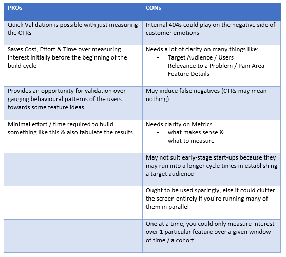
And yes, in no way is it to be considered fool proof. Just as any other technique / methodology this one too comes with its Pros & Cons.
Elevated Trap Doors for UI
I came across an interesting debate over:
“how many UI features your product ought to have?”.
Well. Talk of building features, many a time it looks like they are built just to showcase technical capability of teams or to add to that Wow-factor.
Take for instance, the Apple iPhone. It has tons of features loaded onto it, that 90% of people who buy the phone would never use some of the features in their whole lifetime. So, those situations get really tricky over which bunch of UI features make sense to a user group / target audience and are good to take to the build stage.
1990s - Well, it’s quite simple, isn’t it? We could just ask the users what they would want to see up there, can’t we?
2020s - Really!? That’s neither a viable proposition nor an option as many product people would proclaim, and quite rightly so too.
So, how would one go about measuring interest of existing user groups over which of those UI elements are wanted & would be used for sure over listing them as a “must have” as a part of their product offering?
That situation right there could probably be the justification behind the need to have something that I'd like to call “Elevated Trap Doors”.
Take a case where we ought to capture the interest of the user groups over a few UI features we’d want to build as a part of enhancing their dashboard experience.
And that calls for an Elevated Trapdoor set up.
“A Case Study”
Product Context
Consider an example as relevant to the current B2C space of Crypto WebApp.
Product Offering
Let’s say the product offers seamlessly unlimited investment options across a whole assortment of the what’s what of the Crypto space. And, the first version release is already LIVE and it allows buying, holding & selling any of the Crypto products known to man so far of course, inclusive of the PnL reports & the payment gateways.
Early Stage
Assume we have seen ample B2C accounts opened over a monthly cohort and the growth has been “ok to satisfactory” so far when we know we have a lot of work to do on the UX front both at the App - UI level and the team - customer support levels.
Goal – Improve engagement
And now as a part of our goal that is to improve engagement we would want to build & load a few features on the UI front that perfectly fit in with our user’s current market requirements and in a way lead to enhancing the whole UX over our portal.
Insights obtained over continuous discovery
When the users need to access historical / time bound data (or) browse asset performance between highly specific timelines they tend to go away from our portal and hinge on other Apps / Google to gain access to this information
Forecasting option is needed in terms of letting investors know how the current events could induce some magnitude of uncertainty and how that would intern impact the asset prices going ahead
Goal setting prompting regular withdrawal notifications is a prime feature that has seen a lot of demand
Potential Biggies would make sense to have as investors inclined towards it may enter early and get locked in for a period expecting to take out bumper returns over the long run
Fresh developments in the Crypto space that impacts the whole asset class need to be covered & delivered
Access to Crypto News as it happens from across the world
Enable user interaction / exchange of thoughts on our Twitter & Facebook page over any topics related to Crypto
Informative videos over the best practices and protocols to follow over Crypto as an asset class in general and trading in particular over our YouTube channel
Elevated Trap Door Implementation
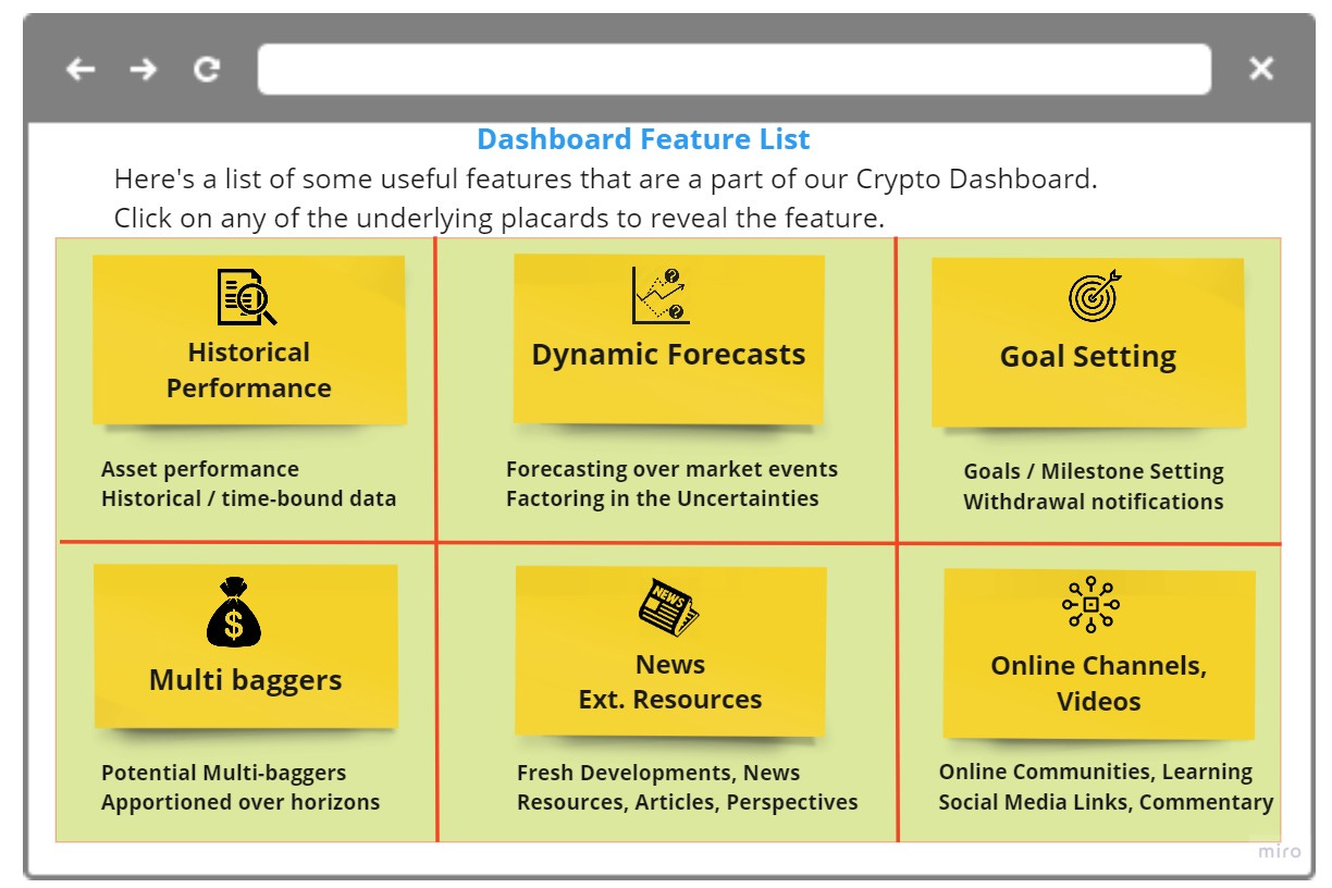
Clicking on the “Dashboard” button from the “Homepage” would direct the user here to this screen which would be our “Elevated Trap Door” Implementation.
Course of Action
Measure CTRs across each of the six split sections of the screen individually tabulating the results
Collect this information across session(s), user(s), cohorts
Clicking on any of these sections could pop a message “Still under construction, check back in a few days to see this feature come alive”
Run the exercise for a period of time (weeks / week-tops) to gather enough input
Final Results
At the end of it all, if you have a hang of your market’s needs and club it with a bit of that research that paved way for the feature list, you may arrive at something like this:
The Elevated trapdoor could be a very elegant way to capture the interest of your existing user base over the UI features that make sense to them and help you sort out and prioritize your backlog in accord with that.
Also, not to mention, you could track various such features across user persona and customer segments if need be.
Conclusion
Elevated trap doors could help by putting you a step ahead in carrying just those set of UI features for a given webpage per se by validating it LIVE in the market and factoring in those voices by regressively gauging the inputs gathered over the measurement of CTRs. And, the advantage it offers over an A/B Test / Split Test is it could get built in absolutely no time at all, as it might not require all that much in terms of coding and could still provide crucial insight on both Qual & Quant parameters helping discern those feature(s) that make perfect sense to have, thus saving a lot of cost & effort - provided one has the time which is a visible drawback in some cases but it could still make the cut, purely based on “relevance”.


