Advanced principles of UX Design
Ever thought about how & why you got hooked to an App after spending a few minutes on it? This is perhaps why...
There could be various reasons why one chooses to use a website / an App at a regular cadence and it is very possible that each of them users have a different reason for it, although they could belong to the same sample space representing a particularly small section of the target market.
For ex: Being a Sudoku lover I did catch on to Microsoft Sudoku earlier on but have now shifted to the web-based www.websudoku.com given how I don’t have to deal with unwanted Ads that interrupt my flow when I am getting engrossed and start tracking my streaks.
Now, it is very possible that someone hates websudoku, how it could come across as totally monochrome as it doesn’t focus on flashy graphics & chooses not to render any of the 81 squares in 3D with vibrant colors like Microsoft does.
When that’s their reason to stay away from the WebApp, those are the very reasons why I stick to it.
Design teams do have their own processes and methodologies (for ex: Design Thinking, Rapid Prototyping) that they meticulously adhere to over their respective workflows and they are there for a purpose. There’s no denying that of course.
But, as a product person you can’t have your design teams deliver an inferior UX and still score on those metrics by the end of every cohort & do it consistently as well, which calls for a deeper understanding to tackle issues pertaining to market behavior in getting concrete answers to:
how are my users are wired?
what do we know about the expectations & maturity of our users?
what does that heatmap suggest when individual expectations are plotted?
Here are a few concepts / principles to help you through the exercise:
1) Cognitive Load
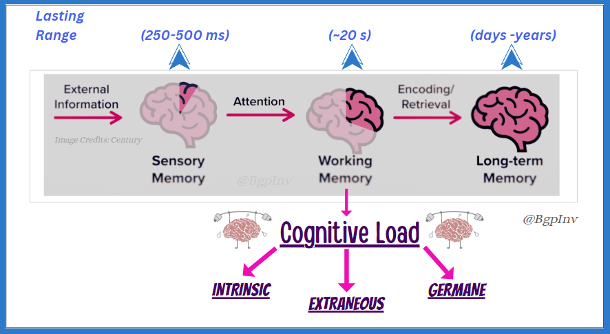
Devised by John Sweller in 1998 the theory of cognitive load refers to the amount of stuff one can hold in working memory that could directly be earmarked for processing, which is roughly around 20 second timeframe as studies suggest.
Representing the complexity of information held in working memory at any stage while processing it, Cognitive load could be further classified as:
Intrinsic Load – the innate complexity native to processing certain info
for ex: Sexagenarian filling out a Passport application online / young Devs in today’s era learning programming in Win32 SDK / VC++
Extraneous Load – the complexity induced by external factors like the manner in which things are designed / organized making it unwittingly tough to process
for ex: steps leading to the payment gateway on some government portals
Germane Load – the strain / effort required to connect new to existing info to help make sense
for ex: covid & the knowledge common people already had regarding viruses
How do you factor in cognitive load?
Be in touch with your design team at a regular cadence and keep a tab on what’s cooking. Ensure they possess a thorough understanding of all types of cognitive load and are factoring them in over each and every step of the design life cycle right from the Lo-Fi mocks right up to the final product.
To build a winning product and deliver it over a seamlessly great UX your team ought to strategically:
understand, enlist & factor in all steps / sequence of events representing the user flow that help them reach their outcome keeping INTRINSIC LOAD at pretty manageable levels
brainstorm, ideate & design a robust UI testing it out thoroughly for all kinds of friction points subjecting mocks to cycles of feedback & course-corrections over usability metrics like:
time for completing (x) task
error rate
bounce rate
misclick rate
time on screen
satisfaction rate
towards minimizing EXTRANEOUS LOAD
obtain consensus by collecting overall feedback over the final feature (ready for release) with the user groups over:
ease of reaching the outcome
time saved compared to other / previous methods
stickiness of the UI
overall UX
helping you affirm whether the solution route you chose is relevant & appreciative so as to maximize GERMANE LOAD
2) Familiarity Principle & 3) Von Restorff Effect
Considering you release a new feature to the users, they’d quite obviously hit a comfort zone if it looks familiar and they possess a decent understanding of it already. The likability could most naturally be influenced if there is a certain degree of familiarity which is precisely what the Familiarity Principle quotes.
A classic example of this may be the workflow of how a deposit screen of a retail banking application in the 2000s seemed to be a spitting image of the form one used to deposit cash if they were to visit the bank in person (number of 100s, 500s, 1000s etc.).
[You can read more about it here: https://theproductweb.substack.com/p/mere-exposure-effect]
And in the same breath the Von Restorff effect suggests that the users ought to be able to segregate & pick the odd element out and pretty much effortlessly as well, leading to some resistance towards adopting something altogether and totally new to them.
An example of this would be how Windows (95, NT, 98, XP) users which actually constituted a pretty significant share of the market in the later 90s & early 2000s almost led to the rejection of Linux as an OS in spite of its proven stability owing to how it was largely perceived as non-user friendly given the CUI (Character User Interface) & how the GUI (Graphical User Interface) bits in the latter versions lacked that punch when pitted against Windows.
How do you effectively employ the familiarity principle & keep the Von Restorff effect at bay?
Apart from being in touch with the user community regularly during the entire build process helping them intern help you shape products / designs in accord to their expectations, these could come in handy:
video narratives
“how to” videos
info-visuals
context based help videos
testimonials
Ensure you collaborate with your design & marketing teams to get these out & make sure you are measuring metrics that pertain to the effectiveness of these assets post floating them so that none of the internal teams miss out on the purpose / the final outcome.
4) Zeigarnik effect & 5) Goal-Gradient Hypothesis
Ever tried filling out an online application for a job and felt like it was a drag? Am sure this has happened to most of you jobseekers more so in the recent past. With some orgs. designing their application process on minimalistic keystrokes to quickly be able to hit that “SUBMIT” / “APPLY” button the classic workflows like for ex: workday could most certainly feel like its engulfed with unwanted complexity. Although there is a “SAVE FOR LATER” button somewhere there what’s the probability of applicants coming back and revisiting it? According to STATS that is not more than 15%.
That’s the Zeigarnik Effect which governs the ability of users to remember unfinished tasks and get back to completing them.
Working around the Zeigarnik effect
One possible workaround for the Zeigarnik effect happens to be the Goal Gradient Hypothesis which suggests that users may be more likely to complete the task if they are aware / feel like they are getting closer to the finish line.
The indicative progress bar is quite unmissable in some Apps clearly mentioning the number of steps in the workflow and also giving the user enough clarity as to where the uses currently are & what remains as for those steps. There’s absolutely no doubt in the value this design element adds to the overall UX whilst also motivating users pushing them towards finishing a task / reach an outcome improving conversions across the funnel.
6) Affective Forecasting
Can you call yourself a product manager if you don’t quote the Henry Ford and the fastest horse over and over again or if you don’t quote the famous line by Steve Jobs about customer’s wants?
It may have been confusing when you stepped into a product role and heard slogans like “the customer is always right” right up to that point in your career and may have had to transition to another extreme train of thought to go “the customers don’t know what they want”.
But both those statements are perfect in their own right, the one thing that’s changing is the parlance. It’s always good to ask the users about what they feel about a feature / a product & primarily gauge whether or not & secondarily up to what degree does it help solve the problem for them. But it may not be a great idea to ask users what they want & dive straight into the build thereof.
And that’s perhaps where the true use of data, behavioral understanding, deriving the right insight & the knowledge, skill, experience, lucidity of a product person who could club all of that under “product sense” could end up being the difference between a product that could break records in terms of user adoption and a mediocre one garnering minimal interest.


